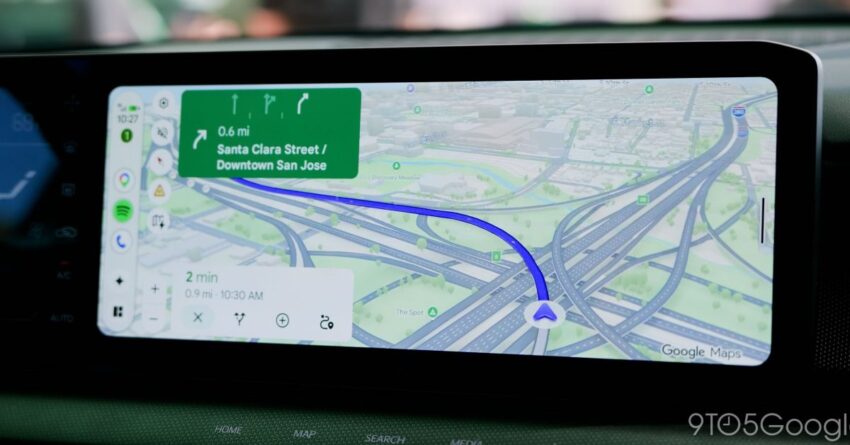
If you use Android Auto and Google Maps for navigation, one of the more annoying parts of the experience may finally be getting fixed. Google is rolling out a redesign for Maps incident alerts that keeps the driving view steadier and makes the pop-up much less disruptive, a notable improvement for anyone who has found the current design overly distracting.
A small interface change with a big impact
Google Maps incident reports arrived in 2024 as part of a feature that echoes one of Waze’s best-known strengths. The alerts made their way to Android Auto a few months later, and support for Waze reports began appearing not long after that. Google has refined the feature several times over the past couple of years, but the alert design itself had stayed mostly the same until now.
That original interface became a point of contention because it could temporarily replace the written directions and estimated time of arrival on the screen. Even if the interruption only lasted a few seconds, it could still pull attention away from the road and force drivers to deal with an overlay before the usual navigation details returned. In a 2025 poll mentioned by 9to5Google, some readers said they preferred the existing behavior, but most others found it at least somewhat distracting.
What has changed in Android Auto
The redesigned alert now appears directly over the estimated arrival time instead of taking over the broader navigation layout. That means the existing interface stays in place, with the directions and other visible elements remaining where they are. The alert appears briefly, offers “Yes” or “No” options, and then disappears without shifting the rest of the display around.
In practice, that makes the alert feel more like a lightweight prompt and less like a screen takeover. The change matters because driving interfaces are especially sensitive to sudden movement. Even if the alert itself is still visible, the fact that it no longer forces nearby elements to jump or vanish reduces the sense of interruption.
How it behaves on different displays
According to 9to5Google’s report, the effect of the redesign varies depending on the size and shape of the car’s display. On a taller screen, such as the one seen in a Subaru Forester, the difference was less dramatic because Google Maps already kept navigation details visible much of the time. Even there, though, the old alert’s shifting layout was described as more distracting than the new version.
On a shorter and wider screen, such as the Kia Niro EV display shown in the report, the new alert still appears without moving the main UI. It does, however, push the shortcuts that usually sit near the ETA slightly lower while the prompt is visible. That adjustment is temporary and limited to the few seconds the alert remains on screen.
Why this update matters for drivers
Navigation software has always had to balance usefulness with distraction, and incident reports are a good example of that tradeoff. These alerts are meant to help drivers avoid hazards or at least stay aware of road conditions ahead, but they need to do so without becoming the thing that distracts from the drive. The new design suggests Google is paying closer attention to how those prompts fit into the overall Android Auto experience.
The redesign also shows that Google is still iterating on Google Maps’ incident-reporting system even after the core feature launched. Since the reports started in Maps, moved into Android Auto, and then expanded with Waze-related data, the underlying product has clearly continued evolving. This latest update focuses less on new functionality and more on usability, which may be exactly what many drivers wanted.
For users who spend a lot of time commuting or traveling with Android Auto, even a subtle improvement like this can make a difference. A prompt that appears in place, without shifting the rest of the screen, is easier to ignore or respond to quickly. That is especially important in cars where the display is already busy with route details, media controls, and other car-friendly shortcuts.
Rolling out now
9to5Google says the new Google Maps alert interface appears to be rolling out to Android Auto users now. The publication was not able to determine whether the change was triggered by a recent Android Auto update or a Google Maps app update, so the underlying delivery mechanism remains unclear.
That uncertainty is fairly common with connected-car software, where visual changes can depend on a mix of app versions, server-side switches, and vehicle-specific implementations. For drivers, the practical takeaway is simply that the redesign is starting to show up in the wild.
Part of a broader Android Auto push
The incident-alert redesign lands amid a steady stream of Android Auto-related updates and integrations. In recent coverage highlighted by 9to5Google, an adapter was introduced to add Android Auto and CarPlay to Chevy and other EVs from GM, at least for now. Google Meet for Android Auto is also rolling out more widely, and Nintendo Music has added Android Auto support as well, an expansion that may please fans looking to soundtrack their drives.
Those examples reflect the broader direction of Android Auto: more apps, more in-car utility, and more attention to how information is presented while driving. The Maps alert change is not a headline-grabbing overhaul, but it fits that same pattern of making the platform easier and safer to use in everyday situations.
A better balance between alerts and attention
For all the debate around the old design, the new version seems to address the main criticism without removing the feature entirely. Drivers still get notified about incidents, and they can still respond with “Yes” or “No,” but the alert no longer dominates the display in the same way. In other words, Google appears to have kept the function while reducing the friction.
That kind of refinement often matters more than a flashy redesign. A good driving interface should help people react quickly, not force them to reassess the screen every time an alert appears. If the rollout continues as reported, Android Auto users should soon benefit from a cleaner, less distracting Google Maps experience on the road.
Source: Original report
Was this helpful?
Explore more: Mobile App Development More Mobile Technology Tech News
Last Modified: July 7, 2026 at 9:39 pm
16 views