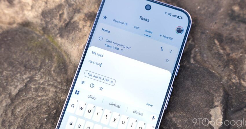
Google Tasks is finally getting a Material 3 Expressive makeover on Android, with a refreshed widget design that is now widely rolling out after first appearing about a month earlier. The update brings a more prominent add button, improved dark-mode theming, and a widget look that better matches Google’s latest Android design language.
Google Tasks widget begins a wider rollout
According to the update posted on June 4, 2026, the Material 3 Expressive redesign of the Google Tasks widget is now broadly available. The change had started showing up nearly a month earlier, but it was not yet widely distributed at the time. Users who want to check for the new widget are advised to make sure they are on version 2026.05.25.x of the Google Tasks app.
If the updated widget does not appear immediately, the report says a manual refresh may help: open the app info page for Tasks and use Force stop. That appears to be enough to prompt the widget to refresh in some cases, though the rollout still seems to depend partly on Google’s server-side controls.
The update is part of a broader series of Google visual changes tied to Material 3 Expressive, Google’s evolving Android design direction. It follows other recent interface updates across Google apps and services, including a new gradient icon for Tasks.
What changes in the new widget
The most visible update is the plus button in the widget’s top-right corner. In the new design, the button sits inside a pill-shaped container, similar to the treatment used in apps such as Gmail and Google Drive. The button also uses a themed background, which makes it stand out more clearly from the rest of the widget.
The redesign is not a complete overhaul, but it does shift the widget closer to the look of other Google apps that have adopted Material 3 Expressive elements. The new button styling gives the widget a more modern and consistent appearance, especially when placed beside other updated Google interfaces on the home screen.
Another meaningful change appears in dark mode. Google Tasks now uses proper Dynamic Color theming in the widget background, allowing it to blend more naturally with the user’s wallpaper and overall system palette. In practice, that means the widget should feel less like a fixed panel and more like a component that belongs on the home screen.
There are no significant changes in light theme, according to the report. In other words, the redesign is most noticeable when the widget is used in dark mode or compared directly against the older layout.
Server-side rollout with app version 2026.04.27.x
The original report said the redesign was being delivered through a server-side update tied to Google Tasks version 2026.04.27.x on Android. At that stage, it had only appeared on one of the devices tested, which suggested that Google was still gradually turning it on for users rather than pushing it to everyone at once.
That staged distribution fits the way Google often deploys UI updates. A newer app version can be installed without the feature immediately appearing, because the final activation is handled remotely. The June 4 update indicates that the rollout has since expanded significantly.
For users, that means the visible change may not align perfectly with the app version alone. Even if Tasks is updated, the redesigned widget may still need time to arrive depending on the server-side rollout status. The recommendation to force stop the app suggests that some devices may need a manual nudge before the new interface shows up.
How it fits into Google’s broader design direction
The Google Tasks widget update is part of a larger transition across Google’s Android apps toward Material 3 Expressive. That design direction tends to emphasize more distinctive surfaces, stronger shape language, and visual details that make interactive elements easier to identify. In this case, the pill-shaped plus button and themed background are the clearest examples of that shift.
The redesign also places Tasks more in line with other Google productivity apps that already use similar visual conventions. Gmail and Google Drive were cited as comparisons for the pill-shaped treatment around the add button. That kind of consistency matters for users who move between Google apps throughout the day, because it helps the company’s products feel connected even when they serve different purposes.
Google Tasks itself has not seen many major interface changes in recent months, which makes this widget update stand out even more. For a lightweight productivity app that many people use primarily from a home screen widget, even small design changes can have an outsized effect on day-to-day use.
What the widget update means for users
- Clearer add control: The plus button is now framed more distinctly, making it easier to spot.
- Better dark-mode integration: Dynamic Color theming helps the widget blend into the home screen more naturally.
- More consistent Google styling: The design lines up more closely with other Google apps using Material 3 Expressive elements.
- Gradual availability: The rollout is server-side, so not every user will see the change at the same time.
For many people, the widget is the quickest way to add or review tasks without opening the full app. That makes the visual layout important: the easier the add button is to identify, the more useful the widget becomes as a quick-access productivity tool.
The design change may not alter how Tasks works, but it does reflect Google’s continuing effort to refresh the look and feel of its Android apps. Widget updates are especially visible because they live on the home screen, where any visual inconsistency stands out immediately against the rest of the device’s interface.
Google Tasks on Android and iOS
The report also notes that Google Tasks recently picked up an updated gradient icon, and that the iOS application recently gained iOS 26 support. On iPhone, the primary change mentioned was the Liquid Glass keyboard, while the rest of the app still uses its previous bottom app bar design, unlike Android’s floating action button approach.
That comparison shows that Google is making platform-specific updates rather than applying the exact same interface across every version of the app. Android is now getting the widget redesign tied to Material 3 Expressive, while iOS has received support-related and keyboard-related changes.
Even though the Android widget update is the more visible design shift in this report, the mention of the updated icon and iOS support suggests Google Tasks is seeing gradual maintenance across platforms rather than a major feature push. The widget redesign is just the latest step in that process.
Why widget updates matter
Widget design can seem minor compared with new features, but it is often one of the most important parts of an Android app experience. Widgets provide immediate access to key functions without requiring a full launch of the app, which makes them especially valuable for list managers, calendars, and task apps.
In that context, a more polished widget can improve day-to-day usability even if the underlying app remains unchanged. A better-themed background, a more obvious add button, and a layout that matches the rest of the system all contribute to a smoother experience. For a task app, those small improvements can make it easier to capture ideas quickly and stay organized.
Google’s decision to update the Tasks widget also signals that the company has not abandoned the app’s visual evolution. Although Google Tasks has not had many major updates recently, the redesign indicates that the app remains in Google’s broader UI refresh cycle.
Availability and what to expect next
As of the June 4 update, the Material 3 Expressive widget redesign was described as widely rolling out. However, because the change is still tied to a staged server-side deployment, it may continue to reach users gradually rather than all at once.
The report also notes that Google Tasks is set for a new icon, as previously reported. That suggests there may be more appearance changes ahead, even if no additional feature changes are currently mentioned. For now, the widget redesign is the clearest sign that Google is continuing to modernize the app’s presentation.
Users who do not yet see the new widget should check their app version, confirm they are on 2026.05.25.x, and consider force stopping the app from App info. If the rollout has reached their account, the widget should then refresh to the new design.
For an app built around quick reminders and simple list management, the update is subtle but important. It does not change how Google Tasks works, but it gives the Android widget a cleaner, more current appearance that better matches Google’s newer visual language.
Source: Original report
Was this helpful?
Explore more: Mobile App Development More Mobile Technology Tech News
Last Modified: July 7, 2026 at 8:47 pm
11 views