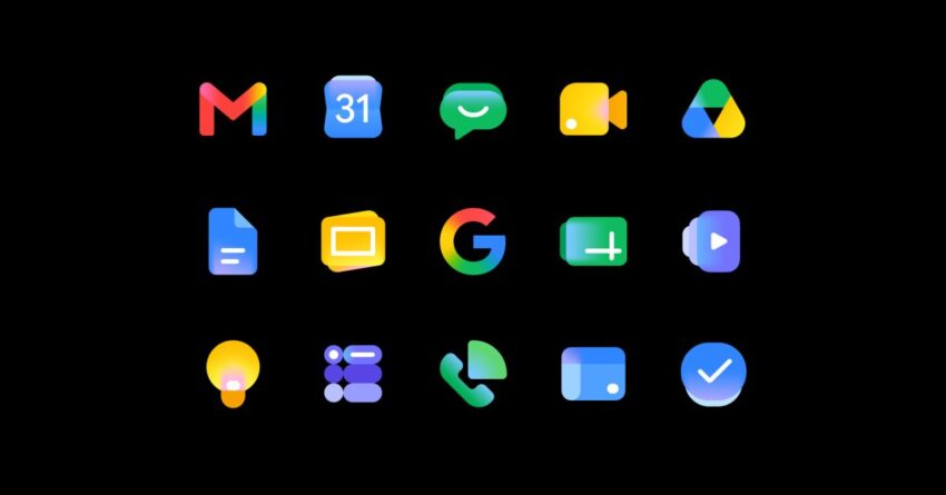
google on why it redesigned the gmail Google has unveiled its redesigned Gmail and Workspace icons, marking a significant visual shift for its suite of productivity tools.
google on why it redesigned the gmail
Introduction to the Redesign
During the Google I/O 2026 event, attendees noticed the new icons for Google Workspace, although the company did not address the redesign during the keynote presentation. Following the event, Google has provided further insights into the motivations and objectives behind this visual overhaul. The redesign aims to enhance user experience and align the icons with contemporary design trends, reflecting a more cohesive identity across Google’s services.
Background of Google Workspace Icons
Google Workspace, which includes applications such as Gmail, Google Drive, Google Docs, and Google Calendar, has undergone several visual updates since its inception. The previous icons had been in use for several years, and while they were functional, they lacked the modern aesthetic that many users have come to expect from digital products today. The need for a refresh was evident as the tech landscape evolved, with many companies adopting sleeker, more minimalistic designs.
Design Philosophy
The redesign of the Google Workspace icons is rooted in a philosophy that emphasizes simplicity, clarity, and user engagement. Google aims to create a visual language that is not only appealing but also intuitive for users. The new icons are designed to be more recognizable and to convey the purpose of each application at a glance.
Key Features of the New Icons
- Color Palette: The new icons feature a more vibrant color palette, which is intended to evoke a sense of energy and creativity. Each application retains its unique color identity while being more harmoniously integrated into the overall suite.
- Simplified Shapes: The shapes of the icons have been simplified to enhance recognition. This approach aligns with current design trends that favor minimalism and clarity.
- Consistency: The redesign ensures a consistent look and feel across all Google Workspace applications, reinforcing brand identity and making it easier for users to navigate between different tools.
Implications of the Redesign
The redesign of the Gmail and Workspace icons is not merely a cosmetic change; it has broader implications for user experience and brand perception. A well-executed visual identity can significantly influence how users interact with a product, impacting everything from usability to emotional connection.
User Experience Enhancement
By adopting a more modern design, Google aims to improve user experience across its platforms. Users often rely on visual cues to navigate applications, and clearer, more recognizable icons can facilitate quicker access to tools. This is particularly important in a professional environment where efficiency is paramount.
Brand Identity and Recognition
The redesign also plays a crucial role in reinforcing Google’s brand identity. As the company continues to expand its suite of services, maintaining a cohesive visual identity becomes essential. The new icons help to establish a unified brand presence, making it easier for users to associate various tools with Google.
Stakeholder Reactions
Initial reactions to the redesign have been mixed, with some users expressing enthusiasm for the fresh look, while others have raised concerns about the changes. Long-time users of Google Workspace may find the new icons jarring at first, as they have become accustomed to the previous designs.
Positive Feedback
Many users and design experts have praised the new icons for their modern aesthetic and improved clarity. The vibrant colors and simplified shapes have been noted as significant improvements that enhance the overall user experience. Some users have expressed excitement about the potential for increased productivity, as the new icons are easier to identify and differentiate.
Criticism and Concerns
Conversely, some users have voiced concerns about the abruptness of the change. For individuals who have relied on the previous icons for years, the new designs may take time to get used to. There is also apprehension regarding the potential for confusion, especially in collaborative environments where team members may have varying levels of familiarity with the new icons.
Future of Google Workspace Design
The redesign of the Gmail and Workspace icons is part of a broader trend within Google to continuously evolve its products to meet user needs. As technology and design trends change, Google is committed to adapting its offerings to remain relevant and user-friendly.
Ongoing Updates and User Feedback
Google has a history of incorporating user feedback into its design processes. The company is likely to monitor reactions to the new icons closely and may make further adjustments based on user input. This iterative approach ensures that Google remains responsive to the needs and preferences of its user base.
Broader Design Trends
The redesign aligns with broader trends in digital design, where minimalism and clarity are increasingly favored. Many tech companies are moving away from overly complex designs in favor of streamlined interfaces that prioritize user experience. Google’s new icons reflect this shift, positioning the company as a leader in modern design practices.
Conclusion
The redesign of the Gmail and Workspace icons represents a significant step for Google as it seeks to enhance user experience and reinforce its brand identity. While initial reactions have been mixed, the overall direction of the redesign aligns with contemporary design trends and reflects a commitment to user-centered design. As Google continues to evolve its products, the new icons may play a crucial role in shaping how users interact with its suite of tools in the future.
Source: Original report
Was this helpful?
Explore more: Software Development More Software Development Tech News
Last Modified: May 27, 2026 at 1:43 am
15 views