these are the office icons microsoft rejected Microsoft has unveiled a series of design concepts for its new Office icons, showcasing a variety of creative directions that were ultimately rejected in favor of the final designs.
these are the office icons microsoft rejected
Introduction to Microsoft’s Icon Redesign
In recent months, Microsoft has been rolling out a fresh set of colorful and curvy icons for its Office suite, which includes popular applications like Word, Excel, and PowerPoint. This redesign aims to modernize the look and feel of the Office applications while maintaining a sense of familiarity for long-time users. However, before settling on the final versions, Microsoft explored various design concepts that reflect a range of creative possibilities.
Exploring the Word Icon Concepts
Design Variations
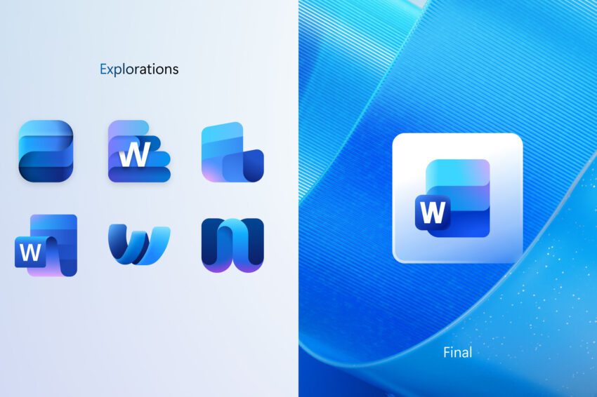
The design concepts for the Word icon reveal a fascinating exploration of visual representation. Among the rejected designs, one notable concept resembles a notepad, emphasizing a more traditional approach to document creation. This design evokes a sense of familiarity, harkening back to the classic tools used for writing and editing.
Other concepts experimented with different ways to visualize stacks of paper or documents, which are central to the Word application. Microsoft played with the idea of making the lettering of “Word” the focal point of the icon, while other versions either blended the lettering into the background or omitted it entirely. This experimentation highlights Microsoft’s intention to innovate while also considering the brand’s established identity.
Final Design Choices
Ultimately, Microsoft opted for a design featuring three horizontal bars instead of four, which creates a cleaner and more streamlined appearance. The final icon includes versions both with and without the “Word” lettering, allowing for flexibility in how the icon is presented across different platforms. This decision reflects a balance between modern aesthetics and user recognition, ensuring that the icon remains identifiable to existing users while appealing to new ones.
Excel Icon Concepts: A Focus on Cells
Consistency in Design
Excel, known for its powerful spreadsheet capabilities, has always emphasized the use of cells in its visual identity. The design concepts for the Excel icon largely adhered to this theme, with most variations maintaining a focus on the grid-like structure that defines the application. This consistency is crucial, as it reinforces the core functionality of Excel as a tool for data organization and analysis.
Among the rejected designs, one concept stood out: an “X” icon that creatively represented the application. This design, while distinct, did not stray far from the final icon that Microsoft ultimately chose. The final Excel icon retains the recognizable green color and cell motif, ensuring that users can quickly identify the application amidst a sea of icons.
Implications of Design Choices
The decision to keep the cell-centric design in the final Excel icon underscores Microsoft’s commitment to user familiarity. By maintaining recognizable elements, Microsoft helps users transition smoothly to the new icons without losing the essence of what Excel represents. This approach is particularly important for businesses and professionals who rely on Excel for critical tasks.
PowerPoint Icon Concepts: Visualizing Slides
Innovative Approaches
PowerPoint, a staple in presentations, has always revolved around the concept of slides. The design concepts for the PowerPoint icon explored various ways to visualize this core function. Some concepts creatively transformed the lettering into a ribbon-like “P,” while others incorporated elements like a pie chart hanging off the letter. These innovative approaches reflect a desire to capture the dynamic nature of presentations.
Final Design Decisions
Despite the bold experimentation, Microsoft ultimately chose a more subdued design for the final PowerPoint icon. The final version features a rounded and colorful take on the existing icon, which aligns with the overall aesthetic of the new Office suite. This decision to tone down the more radical concepts suggests a preference for stability and user familiarity over radical innovation.
Broader Implications of Icon Redesign
Cross-Platform Consistency
As Microsoft rolls out these new icons across various platforms, including Windows and iOS, the design choices carry significant implications for user experience. The company appears to be implementing versions with letters in Windows, while opting for icons without distinctive letters for iOS. This strategy reflects an understanding of platform-specific design preferences and user behavior.
Stakeholder Reactions
The reactions from stakeholders, including users and design professionals, have been mixed. Some users appreciate the fresh look and feel of the new icons, citing a modernized aesthetic that aligns with contemporary design trends. Others express nostalgia for the previous icons, feeling a sense of attachment to the familiar imagery they have used for years.
Design professionals have also weighed in, noting that while the new icons are visually appealing, the decision to retain recognizable elements is crucial for maintaining user trust. The balance between innovation and familiarity is a delicate one, and Microsoft appears to be navigating it with care.
Conclusion: The Future of Microsoft Office Icons
The exploration of design concepts for the new Office icons reveals Microsoft’s commitment to innovation while respecting its established brand identity. The rejected designs offer a glimpse into the creative process behind the final icons, highlighting the importance of user familiarity in software design. As Microsoft continues to roll out these new icons, the reactions from users and stakeholders will likely shape future design decisions.
Ultimately, the new Office icons represent not just a visual update, but a reflection of Microsoft’s ongoing evolution as a technology leader. The balance between modern aesthetics and user recognition will play a significant role in shaping the future of the Office suite, ensuring that it remains relevant in an ever-changing digital landscape.
Source: Original report
Was this helpful?
Last Modified: October 15, 2025 at 3:36 pm
4 views