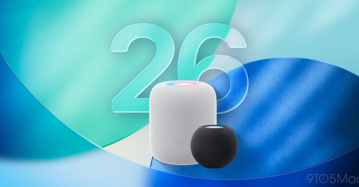
new ios 26 icons here s how Apple has unveiled a significant redesign for its app icons in iOS 26, marking the first major update since iOS 7.
new ios 26 icons here s how
Overview of iOS 26 Redesign
The introduction of iOS 26 brings a fresh aesthetic to Apple’s mobile operating system, with a particular emphasis on the app icons that populate the iPhone home screen. This redesign is part of a broader initiative known as the Liquid Glass redesign, which not only refreshes the app icons but also revamps system components such as buttons and tab bars. The new visual style is intended to provide a more cohesive and modern user experience, aligning with current design trends while maintaining Apple’s signature simplicity.
Significance of the Redesign
The last time Apple undertook a comprehensive redesign of its app icons was with the launch of iOS 7 in 2013. Since then, the app icons have remained relatively unchanged, leading to a sense of stagnation in the visual identity of the operating system. The iOS 26 update aims to breathe new life into the user interface, making it feel more contemporary and visually appealing.
Liquid Glass Design Philosophy
The Liquid Glass design philosophy emphasizes transparency, depth, and a sense of fluidity. This approach is evident in the new app icons, which feature smoother edges, more vibrant colors, and a polished finish that mimics the look of glass. The redesign not only enhances the aesthetic appeal but also aims to improve usability by making icons more distinguishable from one another.
Comparison of App Icons
To illustrate the changes, Apple has provided a side-by-side comparison of the new iOS 26 app icons alongside their iOS 18 counterparts. This visual juxtaposition allows users to assess the evolution of the icons and determine how the new design aligns with their preferences.
- Messages: The Messages app icon has transitioned from a flat green bubble to a more three-dimensional design with subtle gradients, enhancing its visibility.
- Photos: The Photos app has adopted a more vibrant color palette, with a sunburst effect that gives it a lively appearance.
- Mail: The Mail app icon has been updated to feature a sleeker envelope design, emphasizing clarity and modernity.
- Maps: The Maps icon now showcases a more detailed representation of a map, complete with recognizable landmarks.
- Safari: The Safari icon has been refined to reflect a more streamlined look, with a focus on the compass motif.
User Reactions
Initial reactions to the new app icons have been mixed, with some users expressing enthusiasm for the fresh look while others prefer the familiarity of the older designs. Apple has a long history of making bold design choices, and the iOS 26 update is no exception. Users who appreciate modern aesthetics are likely to embrace the new icons, while those who favor a more traditional appearance may find the changes jarring.
Community Feedback
Online forums and social media platforms have been buzzing with discussions about the redesign. Some users have praised the new icons for their vibrancy and clarity, noting that they make the home screen feel more dynamic. Others, however, have voiced concerns that the new designs may not be as intuitive as their predecessors, particularly for users who have grown accustomed to the older icons.
Implications for Developers
The redesign of app icons in iOS 26 also has implications for app developers. With the introduction of new visual styles, developers will need to consider how their apps fit within the updated aesthetic of the operating system. This may involve redesigning their own app icons to ensure they align with the new look and feel of iOS 26.
Guidelines for Icon Design
Apple typically provides developers with guidelines for designing app icons that are consistent with the overall visual language of iOS. With the release of iOS 26, developers will need to pay close attention to these guidelines to ensure their apps remain visually appealing and cohesive with the new system icons. This may include:
- Adopting a similar color palette that complements the new system icons.
- Utilizing gradients and depth to create a three-dimensional effect.
- Ensuring that icons are easily recognizable and distinguishable from one another.
Background on iOS Design Evolution
The evolution of iOS design has been marked by significant milestones, each reflecting changes in technology, user preferences, and design trends. The transition from skeuomorphic designs in earlier versions to the flat design introduced in iOS 7 represented a major shift in Apple’s approach. The Liquid Glass redesign in iOS 26 signals a return to more dimensional and vibrant aesthetics, suggesting that Apple is once again adapting to the changing landscape of digital design.
Historical Context
When iOS 7 was launched, it was met with mixed reviews, as users grappled with the departure from the familiar skeuomorphic designs that characterized earlier versions. Over the years, Apple has made incremental updates to the user interface, but the core design language remained largely intact until now. The iOS 26 update represents a bold step forward, indicating that Apple is willing to take risks in pursuit of a more modern and engaging user experience.
Future of iOS Design
As Apple continues to innovate and refine its operating system, the future of iOS design will likely involve further exploration of new visual styles and user interface paradigms. The introduction of the Liquid Glass redesign may set the stage for future updates, as Apple seeks to balance aesthetic appeal with functionality.
Potential Trends
Looking ahead, several trends may shape the future of iOS design:
- Increased Personalization: Users may expect more options for customizing their home screens, including the ability to choose from a variety of icon styles and themes.
- Enhanced Interactivity: Future updates may focus on making app icons more interactive, allowing users to access features directly from the home screen.
- Integration of Augmented Reality: As AR technology continues to evolve, Apple may incorporate AR elements into the user interface, creating a more immersive experience.
Conclusion
The redesign of app icons in iOS 26 marks a significant milestone in the evolution of Apple’s mobile operating system. By embracing a new visual style that emphasizes depth, color, and modernity, Apple aims to enhance the user experience while staying relevant in an ever-changing digital landscape. As users adapt to the new icons and developers respond to the updated design guidelines, the impact of this redesign will likely be felt across the iOS ecosystem for years to come.
Source: Original report
Was this helpful?
Last Modified: September 16, 2025 at 1:53 am
26 views