Google is making a pair of small but noticeable changes to the Gemini experience on Android, with a new Dynamic Color treatment arriving in the Gemini overlay and the “Screen content” tool moving into the main prompt carousel. The updates come shortly after the larger Neural Expressive redesign introduced at I/O 2026, and they continue Google’s gradual effort to make Gemini feel more integrated and easier to use across Android.
Gemini overlay gains Dynamic Color
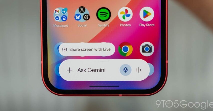
The most visible change is the addition of Dynamic Color to the Gemini overlay, the floating interface that appears when users invoke Gemini on Android. According to the report, this theme support is especially easy to spot in dark mode, where the text field and related chips are no longer rendered in plain gray. Instead, the overlay now picks up colors more closely aligned with the rest of the device’s system theme.
In light theme, the difference is subtler. The main pill used to open the overlay does not change dramatically, aside from the microphone icon, but the experience becomes more obvious once users open the “plus” menu. There, the sheet itself is tinted, and the carousel options appear more clearly themed than before. In other words, the visual update is not a full redesign, but it does bring the overlay closer to the look and feel Android users typically expect from Dynamic Color-enabled surfaces.
This change is not limited to beta testers. The source material says Dynamic Color for the Gemini overlay is rolling out to stable users with Google app version 17.28, after first appearing in beta version 17.28. The update follows the broader redesign work Google unveiled at I/O 2026 last month, though the new theming appears to be a more incremental refinement than a major interface overhaul.
Overlay vs. full Gemini app
One detail worth noting is that the Dynamic Color treatment applies to the overlay, but not to the full Gemini app chat interface. The report says users can open the Gemini app directly to compare the two experiences, and the full chat view does not yet use Dynamic Color in the same way. That makes the overlay the first place where the updated theming is currently visible, rather than a system-wide Gemini design shift.
That distinction matters because the overlay and the app serve slightly different roles. The overlay is meant for quick interactions, often summoned on top of whatever else a user is doing, while the full app is the more complete chat experience. Google’s decision to update the overlay first suggests it is focusing on the entry point users are most likely to access quickly from anywhere on the device.
“Screen content” joins the main carousel
Google is also reorganizing Gemini’s prompt tools by moving “Screen content” into the main carousel. The feature lets Gemini capture the current display and add it to the prompt, which can be useful when a user wants the assistant to understand what is on screen without manually describing it. In the updated overlay, it now sits alongside Photos, Camera, Files, Drive, and Notebooks.
This is a small interface change, but it makes the tool easier to find and keeps the prompt composer more compact. Previously, “Screen content” appeared in the tools list with Images and Personal Intelligence. Bringing it into the main row of options should reduce the number of taps needed to access it and makes the feature feel like a core part of the Gemini workflow rather than a secondary tool tucked away in a deeper menu.
The source notes that this change is widely rolled out in the stable channel with version 17.26 of the Google app. If users do not see it yet, the report recommends force stopping the Google app. That suggests the rollout may still be propagating across devices, even though it is no longer limited to beta software.
What these changes suggest about Google’s Gemini strategy
Neither update is major on its own, but both point in the same direction: Google is refining Gemini to be more polished and more immediately useful on Android. Dynamic Color gives the overlay a more native look, helping it blend into the broader Android visual language. Moving “Screen content” into the primary tool row, meanwhile, lowers friction for one of Gemini’s more practical capabilities.
These are the kinds of changes that often matter more in day-to-day use than headline-grabbing feature launches. A more visually integrated overlay may not alter what Gemini can do, but it can make the experience feel less bolted on. Likewise, a tool that is easier to reach may be used more frequently simply because it is visible at the right moment.
The timing also fits with Google’s broader cadence of Gemini updates. The source material links these changes to the latest round of Android-side improvements following the I/O 2026 redesign, and it references several other recent Gemini-related developments, including Gemini Spark for Google AI Ultra users in the US, revised usage limits, and new Gemini Live voices with updated Android widget icons. Taken together, these updates show Google continuing to iterate quickly on the Gemini ecosystem across both consumer-facing and power-user features.
Stable and beta rollout details
For users trying to spot the changes on their own devices, the rollout status is split between the two updates. Dynamic Color in the Gemini overlay is associated with Google app version 17.28 and is now rolling out to stable users, following its appearance in beta. The “Screen content” relocation, by contrast, is already widely available in stable via version 17.26.
That means some Android users may encounter both changes at once, while others may see only one depending on which app version has reached their device. As is often the case with Google app updates, the rollout may be staged, so availability can vary even among users on the same channel. The report’s suggestion to force stop the Google app if the new tool placement is not showing up implies that the feature may already be present but not yet surfaced correctly in every case.
Why the changes are modest but meaningful
At a glance, these updates may sound minor compared with larger Gemini announcements. But they reflect a common pattern in Google’s product development: major redesigns create the framework, and then smaller follow-up adjustments make the experience more coherent. Dynamic Color is part of that coherence, especially for Android users who expect Google’s surfaces to adapt to system theming. Repositioning “Screen content” likewise reflects an effort to simplify the interface around the actions people are most likely to use.
For a product like Gemini, which is still evolving across app, overlay, and device integrations, such refinements can shape perception as much as new features do. A cleaner overlay and more accessible tools may not generate the same attention as a new model or assistant capability, but they are the kind of updates that can improve usability every time someone opens the assistant.
In short, Google is continuing to polish the Android Gemini experience. The new Dynamic Color overlay makes the assistant feel more at home in the operating system, while the updated tool layout puts “Screen content” front and center. Together, the changes suggest a continued push to make Gemini not just more capable, but also easier and more pleasant to use.
Source: Original report
Was this helpful?
Explore more: AI Automation Services More AI & Automation Tech News
Last Modified: July 7, 2026 at 9:26 pm
13 views