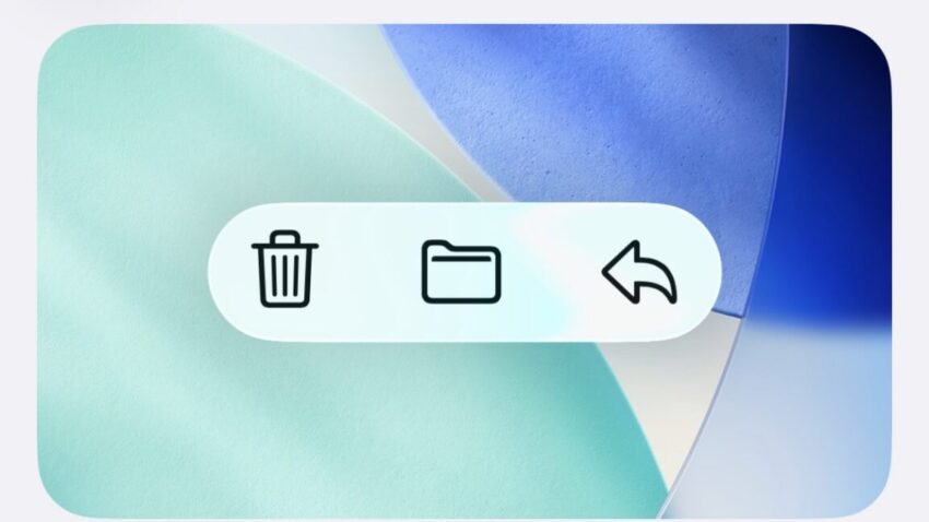
upcoming ios and macos 26 1 update Apple is set to enhance user experience with the upcoming iOS and macOS 26.1 update, introducing a new feature that allows users to adjust the opacity of the Liquid Glass interface.
upcoming ios and macos 26 1 update
Introduction to Liquid Glass
Apple’s Liquid Glass user interface design has been a significant talking point since its introduction in recent software updates. This design choice aimed to create a more fluid and translucent experience across iOS, iPadOS, macOS, and other Apple operating systems. While the aesthetic appeal of Liquid Glass is undeniable, it has also sparked a range of opinions among users and reviewers alike. Many have noted that the default settings can sometimes hinder readability, particularly in certain contexts.
Understanding the 26.1 Update
The forthcoming 26.1 update seeks to address some of the concerns raised by users regarding the Liquid Glass interface. However, rather than overhauling the default appearance, Apple is introducing a new toggle feature that allows users to choose between a Clear and Tinted look for Liquid Glass. The Clear option maintains the original aesthetic, while the Tinted option increases opacity and contrast, aiming to enhance visibility without completely sacrificing the translucent quality that defines Liquid Glass.
Details of the Tinted Toggle
The Tinted toggle serves as a middle ground between the default visual settings and the existing “reduce transparency” option found within the Accessibility settings. The latter is a more drastic measure, altering various aspects of the operating system’s appearance and functionality. In contrast, the Tinted toggle provides a nuanced adjustment, allowing users to retain the overall look of Liquid Glass while improving the visibility of colors and shapes beneath the glassy interface.
Visual Examples
To illustrate the differences, consider the default glassy look of notifications in iOS 26.1. The notifications appear sleek and modern, but the translucency can sometimes obscure important information. With the Tinted toggle activated, the notifications take on a fogged appearance, which enhances readability while still preserving a hint of translucency. This adjustment is particularly beneficial for users who find the default settings challenging to read in various lighting conditions.
In macOS 26.1, the toggle’s performance has been noted to be less consistent, but it still offers a valuable option for users. For example, in the Photos app, the glassy interface can initially seem visually appealing but may lack clarity. When the Tinted toggle is engaged, the interface becomes more user-friendly, allowing for better differentiation between elements on the screen.
Implications of the Update
The introduction of the Tinted toggle is significant for several reasons. First, it acknowledges user feedback regarding the Liquid Glass design. Apple has a history of listening to its user base, and this update is a clear indication that the company is willing to adapt its designs based on user experience. By providing options, Apple empowers users to customize their interface according to their preferences and needs.
Accessibility Considerations
Accessibility is a critical aspect of modern software design, and the Tinted toggle aligns with Apple’s commitment to making its products usable for everyone. The previous “reduce transparency” option, while helpful, was somewhat limited in its application. Users who required a clearer interface often had to sacrifice other visual elements, which could detract from the overall experience. The Tinted toggle offers a more refined solution, allowing users to enhance visibility without compromising the aesthetic appeal of the Liquid Glass design.
Stakeholder Reactions
Reactions from stakeholders, including users and industry experts, have been varied. Many users have expressed appreciation for the new toggle, viewing it as a thoughtful addition that addresses a common complaint. “It’s great to see Apple responding to feedback,” one user commented. “The Tinted toggle makes a noticeable difference in readability, especially in bright environments.”
Industry experts have also weighed in, noting that this update reflects a broader trend in software design where user customization is becoming increasingly important. “In an era where personalization is key, Apple’s decision to introduce the Tinted toggle is a step in the right direction,” said a technology analyst. “It shows that Apple is not just focused on aesthetics but also on functionality and user experience.”
Potential Challenges
Despite the positive feedback, there are potential challenges associated with the Tinted toggle. For instance, some users may find the transition between the Clear and Tinted options to be jarring. The change in opacity and contrast may not be suitable for everyone, and some users may prefer the original Liquid Glass aesthetic. Additionally, the inconsistency observed in macOS 26.1 could lead to confusion among users who expect a uniform experience across devices.
Future Updates
As Apple continues to refine its software, it is likely that future updates will build upon the feedback received from the introduction of the Tinted toggle. The company may explore additional customization options or enhancements to the Liquid Glass interface, further improving usability and aesthetics. The ongoing dialogue between Apple and its user base will be crucial in shaping the direction of future updates.
Conclusion
The upcoming iOS and macOS 26.1 update represents a significant step forward in enhancing user experience through the introduction of the Tinted toggle for the Liquid Glass interface. By offering users the choice between Clear and Tinted options, Apple is acknowledging the importance of readability and accessibility in its design philosophy. As the tech landscape continues to evolve, it will be interesting to see how Apple further adapts its software to meet the diverse needs of its users.
Source: Original report
Was this helpful?
Last Modified: October 22, 2025 at 3:36 pm
2 views


