microsoft s new office icons are more Microsoft has officially unveiled its new Office icons today, marking a significant shift in the visual identity of its productivity suite.
microsoft s new office icons are more
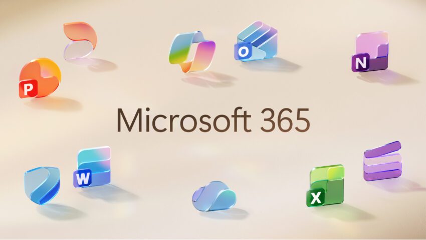
Overview of the New Design
Microsoft’s redesign of its Office icons introduces a modern aesthetic that is both colorful and playful. This update is not merely cosmetic; it reflects a broader design philosophy that aligns with the company’s recent developments in user experience and interface design, particularly through its Fluent design system. The overhaul affects all ten core Office applications, including Word, Excel, PowerPoint, and Outlook, among others.
Inspiration Behind the Redesign
The new icons draw inspiration from the Copilot icon, a feature that integrates artificial intelligence into Microsoft 365 applications. This connection emphasizes a more cohesive design language across Microsoft’s products. Jon Friedman, the corporate vice president of design and research for Microsoft 365, elaborated on this connection, stating, “The core 10 Office apps were last updated in 2018, and the way we described what the designs represented is almost identical to language used today: connection, coherence, seamless collaboration, fluid transitions.”
This statement underscores the intent behind the redesign: to create a more unified and integrated user experience. The previous icons, while functional, lacked the vibrancy and fluidity that the new designs aim to convey.
Key Features of the New Icons
The new Office icons feature several notable changes that enhance their visual appeal and usability:
- Color Gradients: Microsoft has adopted richer and more vibrant color gradients for its icons. Friedman notes that “where gradients were once subtle, they’re now richer and more vibrant, featuring exaggerated analogous transitions that improve contrast and accessibility.” This shift not only makes the icons more visually striking but also enhances their legibility, particularly in smaller sizes.
- Simplified Designs: The new icons are more streamlined than their predecessors. For example, the Word icon has transitioned from four horizontal bars to three, improving clarity and legibility. This simplification is part of a broader trend in design that favors minimalism and ease of understanding.
- Fluid Forms: The redesign embraces softer, more fluid shapes, moving away from the bold, static designs of the past. Friedman explains, “We’ve moved away from bold, static solidity to embrace softer, more fluid forms.” This change introduces smooth folds and curves, giving the icons a sense of playful motion and approachability.
Implications for Users
The redesign of the Office icons is not just a visual update; it carries significant implications for users. The new icons are designed to be more intuitive, making it easier for users to navigate the suite of applications. This is particularly important in an era where remote work and digital collaboration have become the norm.
Enhanced Accessibility
One of the primary goals of the redesign is to improve accessibility. The vibrant gradients and simplified shapes contribute to a more inclusive design that can be easily understood by a wider audience. This is especially crucial for users with visual impairments, as the improved contrast and clarity can make a significant difference in usability.
Microsoft has been increasingly focused on accessibility in its products, recognizing the diverse needs of its user base. The new icons are a continuation of this commitment, ensuring that all users can benefit from the tools provided by Microsoft 365.
Impact on Collaboration
In a world where collaboration is key, the new icons symbolize a shift towards seamless teamwork. The emphasis on connection and coherence in the design reflects the way teams work today—often across different locations and devices. The playful and approachable nature of the icons may also contribute to a more positive user experience, encouraging engagement and interaction among team members.
As organizations continue to adapt to hybrid work environments, the visual identity of tools like Microsoft Office plays a crucial role in shaping user perceptions and experiences. A more inviting design can foster a sense of community and collaboration, which is essential for productivity.
Comparison with Competitors
Microsoft’s redesign of its Office icons comes at a time when other tech giants are also refreshing their visual identities. For instance, Google recently updated its logo, adopting a more modern look that aligns with its focus on user experience. This trend highlights a broader movement in the tech industry towards more vibrant and accessible designs.
Google’s Approach
Google’s new logo features a similar emphasis on color and simplicity, with gradients that enhance visibility and appeal. This alignment in design philosophy between Microsoft and Google suggests a recognition of the importance of visual identity in user engagement. Both companies are striving to create products that are not only functional but also aesthetically pleasing.
Implications for the Industry
The shift towards more colorful and playful designs in tech products may signal a broader trend in the industry. As companies seek to differentiate themselves in a crowded marketplace, visual identity becomes a key factor in attracting and retaining users. The emphasis on accessibility and user experience is likely to continue shaping design choices across the tech landscape.
Future Developments
The new Office icons will begin rolling out in the coming weeks across various platforms, including web, desktop, and mobile. This phased approach allows Microsoft to gather user feedback and make any necessary adjustments before a full rollout.
User Feedback and Iteration
As the new icons are introduced, user feedback will play a crucial role in shaping future iterations. Microsoft has a history of responding to user input, and the company is likely to monitor reactions closely to ensure that the new designs meet the needs and expectations of its user base.
The ability to adapt and iterate based on feedback is a hallmark of successful design, and Microsoft’s commitment to this process will be essential as it navigates the complexities of user preferences and technological advancements.
Long-Term Vision for Microsoft 365
The redesign of the Office icons is part of a larger vision for Microsoft 365, which aims to create a more integrated and user-friendly ecosystem. As the company continues to innovate and expand its offerings, the visual identity of its products will remain a critical component of its strategy.
The new icons serve as a visual representation of Microsoft’s commitment to enhancing user experience, fostering collaboration, and embracing modern design principles. As the landscape of work continues to evolve, Microsoft’s focus on creating a cohesive and accessible suite of tools will be vital for its long-term success.
Conclusion
Microsoft’s unveiling of its new Office icons marks a significant step in the evolution of its productivity suite. The modern, colorful, and playful designs reflect a commitment to accessibility, collaboration, and user experience. As these icons begin to roll out, they will not only change the visual landscape of Microsoft 365 but also influence how users interact with these essential tools in their daily work.
The redesign is a clear indication that Microsoft is not only keeping pace with industry trends but is also setting the stage for future innovations. As the company continues to refine its products and services, the new icons will serve as a reminder of the importance of design in shaping user experiences and fostering collaboration in an increasingly digital world.
Source: Original report
Was this helpful?
Last Modified: October 1, 2025 at 9:40 pm
6 views