google phone app gets short material 3 Google’s Phone app has undergone a significant redesign, aligning itself with the Material 3 Expressive design principles by introducing a more compact bottom bar.
google phone app gets short material 3
Understanding Material 3 Expressive Design
Material 3, also known as Material You, is Google’s latest design language that emphasizes personalization and adaptability. It allows developers to create user interfaces that are not only visually appealing but also responsive to user preferences. The Expressive variant of Material 3 focuses on enhancing user experience through dynamic color palettes, customizable components, and a more fluid layout. This design philosophy aims to make apps feel more integrated with the user’s environment, creating a sense of harmony between the digital and physical worlds.
Key Features of Material 3 Expressive
The Material 3 Expressive design framework introduces several key features that enhance usability and aesthetics:
- Dynamic Color: The interface can adapt its color scheme based on the user’s wallpaper and preferences, creating a cohesive look across the device.
- Customizable Components: Developers can create components that allow for greater user personalization, making the app feel unique to each individual.
- Fluid Layouts: The layout adjusts based on screen size and orientation, providing an optimized experience on various devices.
- Enhanced Accessibility: Material 3 prioritizes accessibility, ensuring that all users can navigate and interact with apps effectively.
The Redesign of the Google Phone App
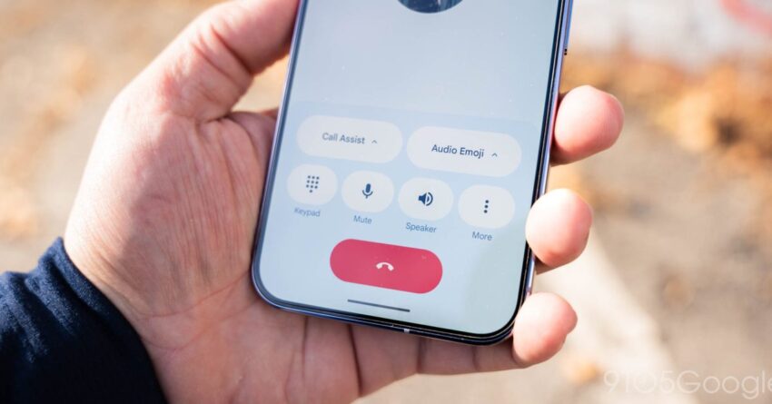
The latest update to the Google Phone app reflects these principles by introducing a shorter bottom bar. This change not only aligns with Material 3 Expressive but also enhances the overall user experience. The bottom bar, which previously occupied a more substantial portion of the screen, has been minimized to provide users with more screen real estate for their interactions.
Implications of the Shortened Bottom Bar
The reduction in size of the bottom bar has several implications for users:
- Increased Usability: With more space available on the screen, users can view more content without needing to scroll. This is particularly beneficial when viewing call logs or contacts.
- Improved Navigation: The compact design allows for easier navigation, as the essential functions are still easily accessible without overwhelming the user with options.
- Enhanced Aesthetics: The slimmer bottom bar contributes to a cleaner, more modern look, aligning with contemporary design trends.
Stakeholder Reactions
The redesign has garnered mixed reactions from users and industry experts alike. While many appreciate the aesthetic improvements and increased functionality, others express concerns about the learning curve associated with the new layout.
User Feedback
Users have taken to various platforms to share their thoughts on the redesign. Positive feedback highlights the following:
- Visual Appeal: Many users have praised the new look, noting that it feels more modern and in line with other Google apps that have adopted Material 3 design principles.
- Functionality: Users have reported that the new bottom bar makes it easier to access frequently used features, such as the dialer and contacts.
Conversely, some users have voiced concerns:
- Learning Curve: A segment of users has expressed difficulty adjusting to the new layout, particularly those who have been accustomed to the previous design for an extended period.
- Feature Accessibility: Some users worry that essential features may become less accessible due to the compact design, especially for those who rely on specific functionalities.
Industry Expert Opinions
Industry experts have also weighed in on the redesign. Many agree that the shift to a Material 3 Expressive design is a step in the right direction for Google:
- Alignment with Trends: Experts note that the redesign aligns with broader trends in mobile app design, emphasizing minimalism and user-centric interfaces.
- Future-Proofing: By adopting Material 3 principles, Google is positioning itself for future updates and enhancements, ensuring that the app remains relevant in a rapidly evolving tech landscape.
Comparative Analysis with Other Apps
To better understand the significance of the Google Phone app’s redesign, it is useful to compare it with other popular communication apps that have also embraced Material 3 design principles.
WhatsApp has made strides in adopting Material You features, including dynamic color schemes and customizable chat backgrounds. However, its bottom navigation remains relatively unchanged, focusing more on functionality than aesthetics. The Google Phone app’s redesign could set a new standard for how communication apps prioritize both usability and visual appeal.
Apple’s iPhone Phone App
Apple’s Phone app has maintained a consistent design language that emphasizes simplicity and functionality. While it offers a clean interface, it lacks the dynamic personalization features that Material 3 provides. The Google Phone app’s shift toward a more expressive design may attract users seeking a more personalized experience.
Future Developments
The redesign of the Google Phone app is likely just the beginning of a broader trend within Google’s suite of applications. As Material 3 continues to evolve, we can expect further updates across various platforms, enhancing user experience and engagement.
Potential Features on the Horizon
Looking ahead, several potential features could be integrated into the Google Phone app:
- AI-Driven Suggestions: Leveraging machine learning to provide users with intelligent call suggestions based on their usage patterns.
- Enhanced Privacy Controls: Offering users more granular control over their data and call privacy settings.
- Integration with Other Google Services: Seamless integration with Google Assistant and other services to enhance functionality.
Conclusion
The redesign of the Google Phone app to align with Material 3 Expressive principles marks a significant evolution in its user interface. By introducing a shorter bottom bar, Google has not only improved usability but also enhanced the app’s aesthetic appeal. While user reactions have been mixed, the overall trend toward a more personalized and fluid design is evident. As Google continues to innovate and adapt its applications, the Phone app serves as a prime example of how design can significantly impact user experience.
Source: Original report
Was this helpful?
Last Modified: January 20, 2026 at 2:07 am
0 views